Devlog #9 - Polish Sprint
Hello and welcome back to the Devlog of "The Backrooms"!
This week we started the Polish Sprint, which means feature lock! No more features could be added and - as the name already says - we focused on polishing all the existing ones and playtesting to find bugs or things, that need improvement!
What did we work on?
Interface
A huge part of the Polish Sprint is the Interface. We already created most of the graphics for it in the Production Sprints, but a lot of them still needed refining and optimizing.
For example the bloodmeter: Previously it was - for some reason - completely in greyscale. We were able to fix that problem and added some details to the frame to make it stand out more. Apart from that, the Skull, which is on the bloodmeter, now has 5 different Tiers - similar to the one of the Protagonist. The higher the Tier, the more spikes and dark drops it has (and the eyes start to glow).

Another part of the interface we worked on to increase player feedback, were the ability-icons. They already had a circular bar which filled up depending on whether or not they were usable again / active, but we added more to it by creating a less-saturated version for when the ability is inactive. Also, the player can unlock the Wall-Phase ability, but until now, might not have even known about it. So we added another icon for the Wall-Phase, which lights up as soon as the ability is unlocked:

The HUD-Elements which display the score were also adjusted. Previously they were divided to two different corners of the screen, but after we got some feedback about it, we decided to put them all together into one. They also needed small adjustments regarding the style, so that they would still fit to the reworked bloodmeter and ability icons.
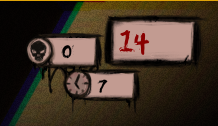
We also worked on the Options-Menu, which didn't have any graphics in the last version and added some more variety to the Leaderboard, so that rank 1-3 stand out more (please ingore those beautiful leaderboard-entries, those were just for testing purposes :D)
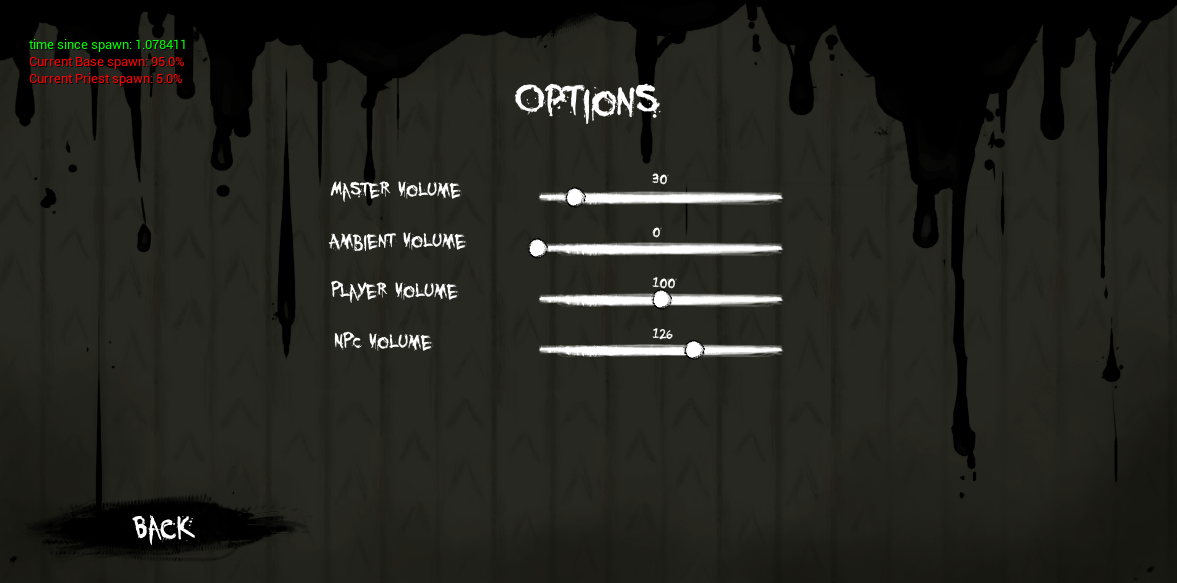
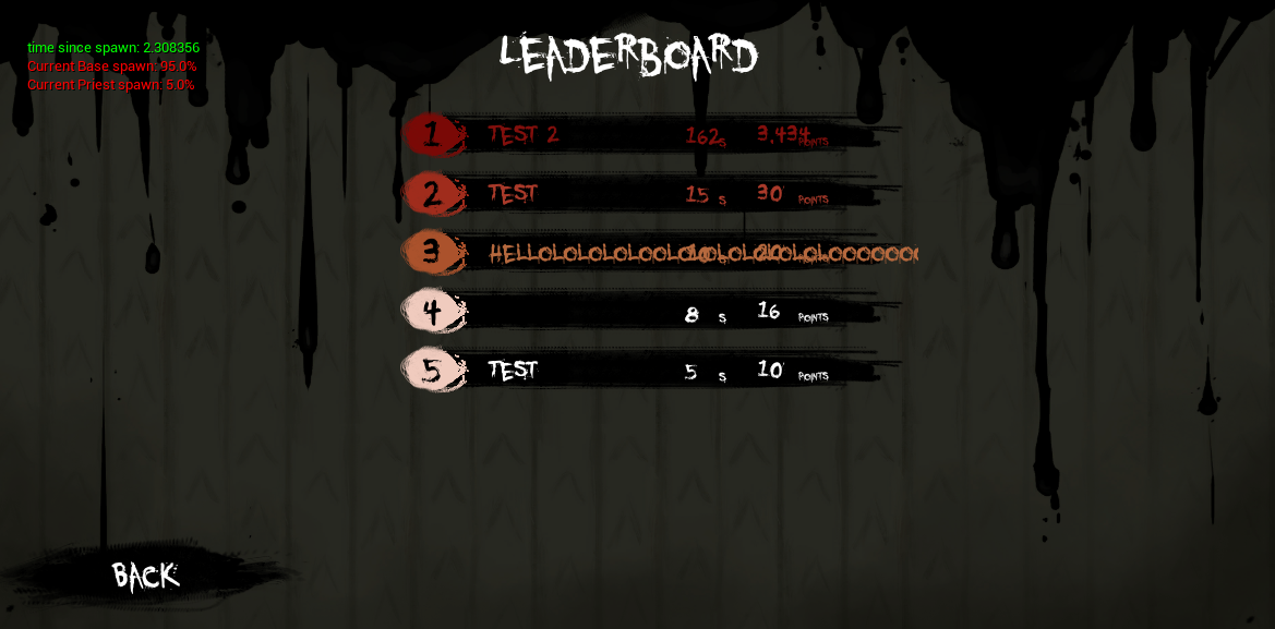
This week, part of the programming was also related to the interface: Even though we enable controller input for the ingame-controlls, so far it was impossible to navigate through the menus with a controller (or to type your name for the leaderboard). Thus, we worked on making the menus controller-interactable and adding a virtual keyboard for text input while using a controller.
Assets
Apart from polishing parts of the interface, we also added a new asset to the game to decorate our level with and we might have the time to add even more in the next week! :)
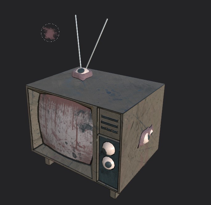
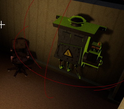
The generator-asset was already existing before, as you probably remember, but I'll tell you about it in this category anyways! Since the generator is an interactable object, we wanted to make that really clear to the player. Currently there was no indication at all and if you don't know about the generator-destruction-mechanic you would probably only find out by accident, that it is possible to destroy it.
Thus, we added an outline-shader to the generators, which make them stand out more, yet still look like part of the environment:
Other Changes
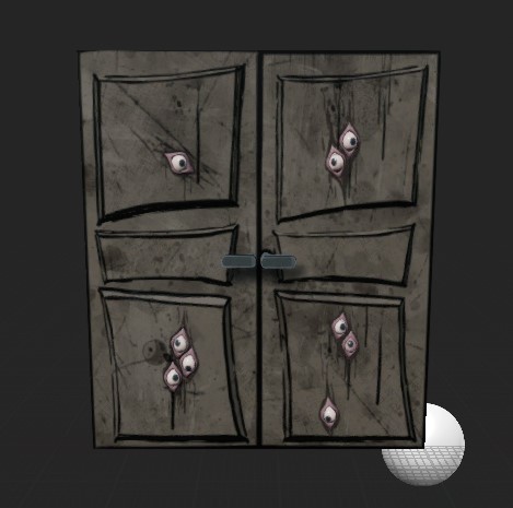
Apart from those previously mentioned additions, we did also work on some smaller fixes and changes: Part of that, were the doors. In the last version, the doors were too small to actually cover the openings in the rooms, so we had to think of a way to change it. We decided to go for double doors for each opening:
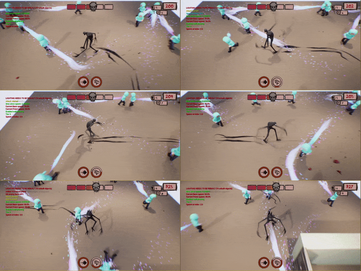
Another aspect of the game we worked on, was the attack of the protagonist. Until now, it was pretty slow, so we decided to speed it up. We also added an RFX to it, which indicates the trail of the hand to better be able to estimate how far the attack reaches and if a human is alread in "kill-range" or not.
The attack-animation needed some work, too: In the last version (and because of some problems, sadly still in this one), the legs would stop moving as soon as you would attack, which doesn't make sense, when the protagonist then starts sliding over the floor. So we implemented blending of those two animations (walk and attack), so that the protagonist would continue walking even though he is attacking.
(As already mentioned above, due to a yet unknown problem, this suddenly stopped working and the protagonist goes back to sliding over the floor, but we're working on finding a solution to this problem. Nevertheless, here is a gif of how beautiful it looked for a few minutes:)
For some additional feedback regarding the current state of the bloodmeter, we added some chromatic aberration effects, which will be more prominent the lower the bloodmeter is. It is basically an equivalent to a "screen turning red" when you're close to death in other games, but we think chromatic aberration fits better to our theme.
Where do we go from here?
We are heading closer and closer to the end - only ONE week in the Polish Sprint is left and then we'll be wrapping up everything for the deadline!
In the next and basically LAST WEEK, we will keep playtesting, continue working on fixing the current issue with the attack-animation-blend, we will create, implement a few more assets, clean up our code, polish some of our RFX and did I mention playtesting?
If you want to playtest yourself, feel free to download the newest version on Tuesday!
Let us know in the comments, if you should have any feedback or questions!
Thanks again for stopping by!
See you next week!
Files
Get The Backrooms
The Backrooms
Game Project for DAE
| Status | In development |
| Authors | Stevus, Salome Vandereyt, Eloise De Backer, YannickGodeau, Carolin Aust |
More posts
- Devlog #10 - RELEASEMay 11, 2021
- Devlog #8 - Last Week of ProductionApr 26, 2021
- Devlog #7 - Production Sprint 2Apr 19, 2021
- Devlog #6 - Production Sprint 2Mar 29, 2021
- Devlog #5 - Production Sprint 1Mar 22, 2021
- Devlog #4 - Production Sprint 1Mar 15, 2021
- Devlog #3 - Final PrototypeMar 07, 2021
- Devlog #2 - PrototypingMar 01, 2021
- Devlog #1 - PrototypingFeb 22, 2021

Leave a comment
Log in with itch.io to leave a comment.